[TIMOB-26224] Android: Modify "OptionDialog" to display a list of normal buttons
| GitHub Issue | n/a |
|---|---|
| Type | Improvement |
| Priority | Medium |
| Status | Closed |
| Resolution | Duplicate |
| Resolution Date | 2019-04-24T22:30:15.000+0000 |
| Affected Version/s | n/a |
| Fix Version/s | n/a |
| Components | Android |
| Labels | OptionDialog, android |
| Reporter | Joshua Quick |
| Assignee | Joshua Quick |
| Created | 2018-07-21T03:50:23.000+0000 |
| Updated | 2019-04-24T22:30:15.000+0000 |
Description
*Summary:*
The
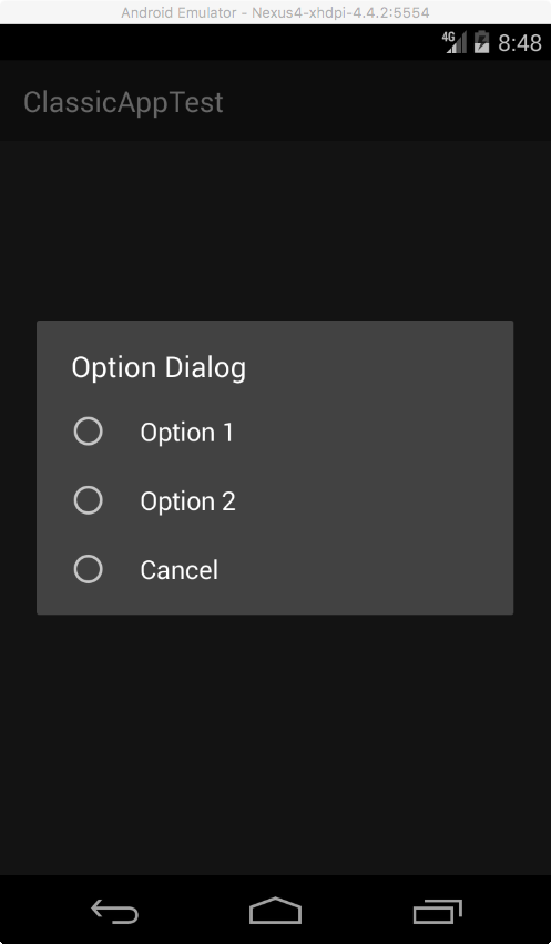
Ti.UI.OptionDialog currently displays a vertical list of radio buttons, but none of the radio buttons are ever enabled if property selectedIndex is not set. This is not a good interface. Especially if the buttonNames property is not set as well.
It would be better to display a vertical list of normal button like how it works on iOS.
var window = Ti.UI.createWindow();
var button = Ti.UI.createButton({ title: "Show Dialog" });
button.addEventListener("click", function(e) {
	var dialog = Ti.UI.createOptionDialog({
		title: "Option Dialog",
		options: ["Option 1", "Option 2", "Cancel"],
		cancel: 2,
	});
	dialog.addEventListener("click", function(e) {
		Ti.API.info("@@@ Dialog 'click' index: " + e.index + ", button: " + e.button + ", cancel: " + e.cancel);
	});
	dialog.show();
});
window.add(button);
window.open();
buttonNames property is also set. In which case, tapping a radio button should not automatically close the dialog. Doing it this way, we'll be following Google's material design guideline here...
https://material.io/design/components/dialogs.html#usage
Attachments
| File | Date | Size |
|---|---|---|
| OptionDialog.png | 2018-07-21T03:50:03.000+0000 | 38674 |
No comments