[TIMOB-28427] Android: Add "borderStyle" and "hintText" properties to Ti.UI.Picker
| GitHub Issue | n/a |
|---|---|
| Type | Improvement |
| Priority | Medium |
| Status | Closed |
| Resolution | Fixed |
| Resolution Date | 2021-05-26T15:32:56.000+0000 |
| Affected Version/s | n/a |
| Fix Version/s | Release 10.0.1 |
| Components | Android |
| Labels | android, border, borderStyle, material-design, picker |
| Reporter | Joshua Quick |
| Assignee | Joshua Quick |
| Created | 2021-04-24T04:11:28.000+0000 |
| Updated | 2021-05-26T15:32:56.000+0000 |
Description
*Summary:*
On Android, if we display the picker as a read-only text field, then we should also add properties [borderStyle](https://docs.appcelerator.com/platform/latest/#!/api/Titanium.UI.TextField-property-borderStyle) and [hintText](https://docs.appcelerator.com/platform/latest/#!/api/Titanium.UI.TextField-property-hintText) that work similarly to
Ti.UI.TextField.
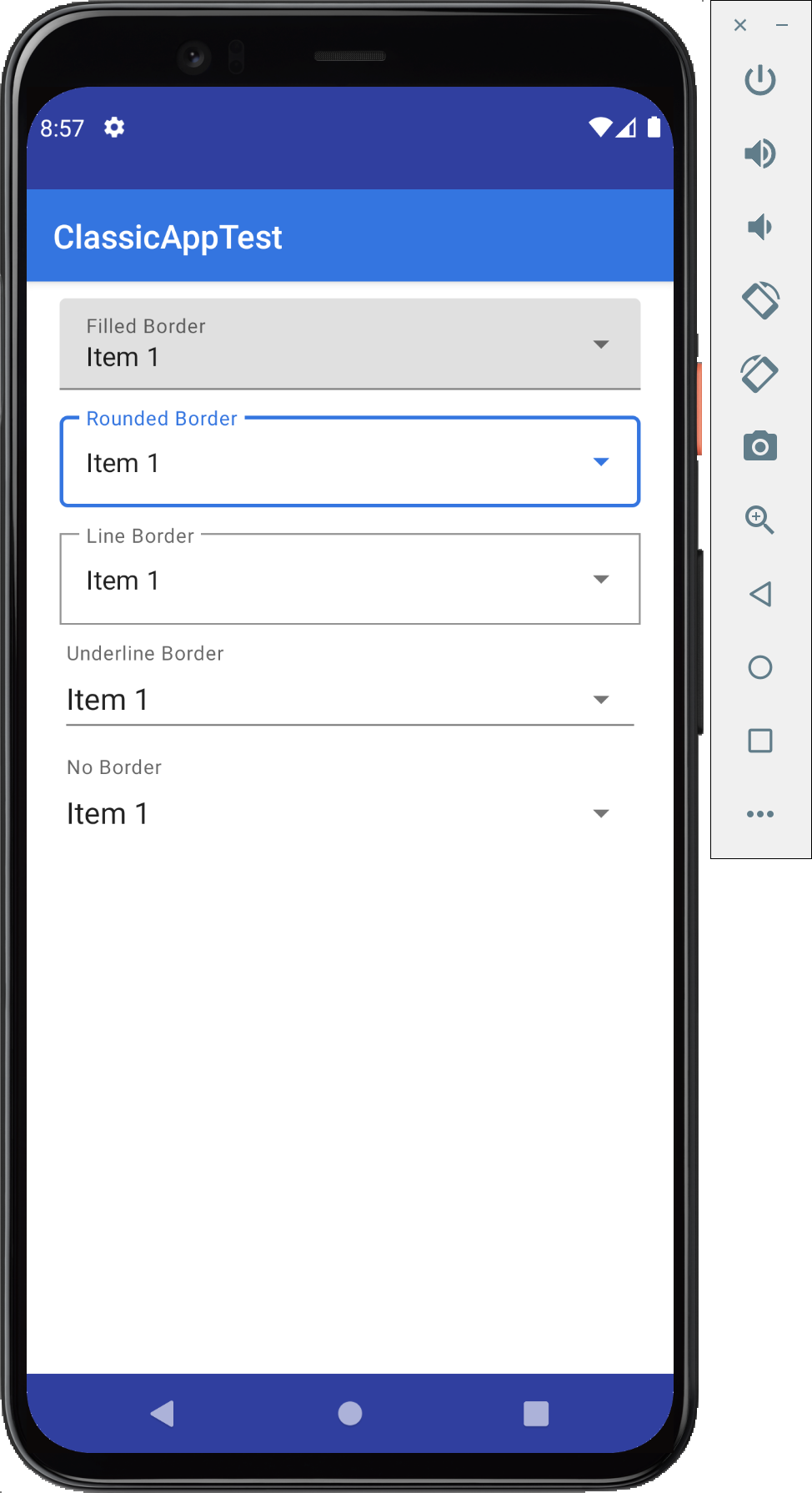
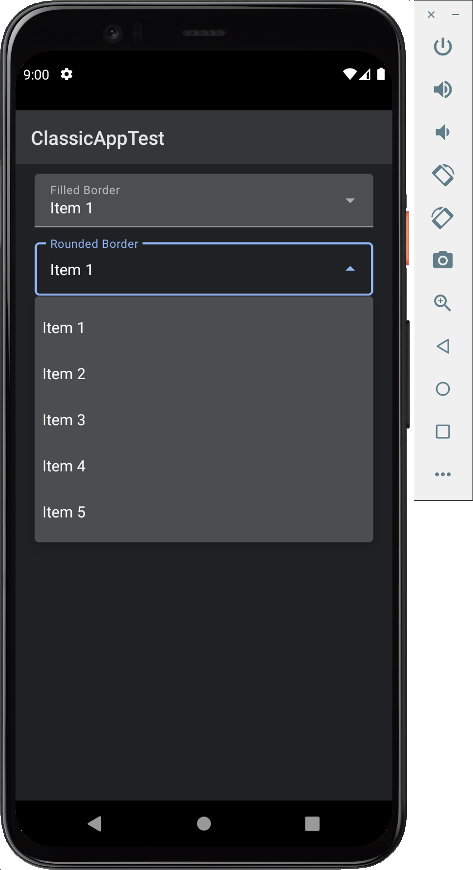
*Drop-Down Picker Support:*
When a Ti.UI.Picker} is set up as [PICKER_TYPE_PLAIN](https://docs.appcelerator.com/platform/latest/#!/api/Titanium.UI-property-PICKER_TYPE_PLAIN) (the default) and its [useSpinner](https://docs.appcelerator.com/platform/latest/#!/api/Titanium.UI.Picker-property-useSpinner) property is set {{true, then the picker is shown as a drop-down field. Titanium currently shows this as a borderless view using the Java Spinner class as shown here...
https://developer.android.com/guide/topics/ui/controls/spinner
It should be changed to use a material [TextInputLayout](https://developer.android.com/reference/com/google/android/material/textfield/TextInputLayout) and [MaterialAutoCompleteTextView](https://developer.android.com/reference/com/google/android/material/textfield/MaterialAutoCompleteTextView) so that it will look like the below. This follows Google's material guidelines and Google's own apps.
!Picker-DropDown-Border-Light.png|thumbnail! !Picker-DropDownClicked-Border-Light.png|thumbnail!
!Picker-DropDown-Border-Dark.png|thumbnail! !Picker-DropDownClicked-Border-Dark.png|thumbnail!
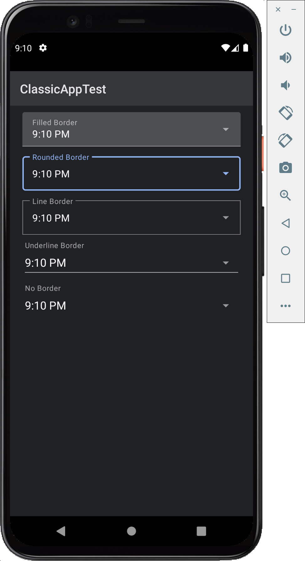
*Compact Date/Time Picker Support:*
When we add support for [DATE_PICKER_STYLE_COMPACT](https://docs.appcelerator.com/platform/latest/#!/api/Titanium.UI.iOS-property-DATE_PICKER_STYLE_COMPACT) via [TIMOB-28426], then the picker will appear as a read-only text field that shows a selection dialog when tapped on. The border style should be configurable to match the border style used by Ti.UI.TextField views.
!Picker-Date-Border-Light.png|thumbnail! !Picker-Date-Border-Dark.png|thumbnail!
!Picker-Time-Border-Light.png|thumbnail! !Picker-Time-Border-Dark.png|thumbnail!
Attachments
| File | Date | Size |
|---|---|---|
| DatePickerBorderTest.js | 2021-04-24T04:06:15.000+0000 | 844 |
| Picker-Date-Border-Dark.png | 2021-04-24T04:08:48.000+0000 | 444954 |
| Picker-Date-Border-Light.png | 2021-04-24T04:08:47.000+0000 | 441766 |
| Picker-DropDown-Border-Dark.png | 2021-04-24T04:01:06.000+0000 | 434408 |
| Picker-DropDown-Border-Light.png | 2021-04-24T04:01:08.000+0000 | 433427 |
| PickerDropDownBorderTest.js | 2021-04-24T03:58:34.000+0000 | 1209 |
| Picker-DropDownClicked-Border-Dark.png | 2021-04-24T04:01:06.000+0000 | 430968 |
| Picker-DropDownClicked-Border-Light.png | 2021-04-24T04:01:06.000+0000 | 434317 |
| Picker-Time-Border-Dark.png | 2021-04-24T04:11:15.000+0000 | 443481 |
| Picker-Time-Border-Light.png | 2021-04-24T04:11:15.000+0000 | 440774 |
| TimePickerBorderTest.js | 2021-04-24T04:09:49.000+0000 | 844 |
PR (master): https://github.com/appcelerator/titanium_mobile/pull/12745
merged to master and 10_0_X for 10.0.1 target