[TIMOB-953] allow buttons in toolbars to support any valid color value (instead of just white)
| GitHub Issue | n/a |
|---|---|
| Type | Bug |
| Priority | Trivial |
| Status | Closed |
| Resolution | Invalid |
| Resolution Date | 2011-04-15T02:40:05.000+0000 |
| Affected Version/s | n/a |
| Fix Version/s | Release 1.5.0 |
| Components | iOS |
| Labels | n/a |
| Reporter | Nolan Wright |
| Assignee | Blain Hamon |
| Created | 2011-04-15T02:40:03.000+0000 |
| Updated | 2017-03-24T18:18:35.000+0000 |
Description
self explanatory
Attachments
| File | Date | Size |
|---|---|---|
| screen-shot-2010-08-27-at-93809-am.png | 2011-04-15T02:40:03.000+0000 | 18606 |
Not fully explained. Do you mean the text color of buttons? The background color?
Is this the toolbar buttons that have no boundary (IE, just the text?) or of toolbar buttons that have a border?
Do note that standard UIBarButtonItems (IE, the type you expect to see on toolbars and navBars) do not have any mechanism for changing background color, text color, text font, or size of text.
Any exposing of these properties will require us to recreate simulations instead of using the built-in native buttons.
back to Nolan "needs more info"
when you place a button in the toolbar (non-bar style), you should be able to set the background color
back to Blain
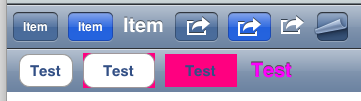
Okay, I've attached a screenshot from Interface Builder to better illustrate things. In the picture are two bars.
The top bar is of bar button items. With bar button items, we can set the text, OR a premade image, OR an image, and one of three styles: Bordered, Done, and Plain. Font is unchangeable. Text color is unchangeable. Background color is unchangeable, as it's based on the owning bar's color in the case of Bordered, and is always blue in the case of Done.
Unrelated, but while I was researching this, I noticed a new premade button, of page curl, added as of 4.0, that we might want to introduce. It ignores the style property.
The bottom bar is of buttons added to the bar. This is a different layout, and one we use when we have backgroundImage, etc. The first button is a rounded rectangle, no background color. The second is with the background color. Note that this background color is put behind the rounded rectangle, not in it. The third is a custom button, with no rounded rectangle, but as you can see, the background color is just an ugly rectangle.
Finally, I made a custom button with text font, text color, Shadow, shadow color, and shows-touch changed to resemble the bar button item. However, this is a simulation. Worse yet, this is probably incompatible with the bordered and done styles.
Bouncing back to Nolan for better clarification of what's desired from what we can do.
ok, i believe this is about using the BAR style button (like the top ones in your screenshot), but being able to apply any backgroundColor to the button regardless of the bar color. We may already support this - can't remember.
Ah. I think this is a case of the iPhone OS API being confusing. We have several items that are closely related, so that they overlap in some areas, and sadly not in others.
UIBarButtonItems (using the native terminology here) are actually not buttons in that they're not views, but represent the buttons you see. They have no view manifestation, and can exist nowhere but within a bar. They come with the various built-in system icons and three backgrounds: plain, bordered (which ALWAYS is the bar's color), and done (which ALWAYS is the blue). As they are not views, there are no colors to set, nor is there anything to insert backgrounds into.
UISegmentedControl is represented in Titanium as both ButtonBar and TabbedBar. It is a view, and has a style that resembles a bordered-style UIBarButtonItem. When placed directly in a bar, it takes on the bar's tint. However, we have fixed this to be any custom color before, by placing it in a view, and then placing THAT in the bar. And a segmented control can have only one segment. So this may be when we already supported it, IE, insert a button bar with only one element, and tint that. However, as this is not a UIBarButtonItem, no system-provided icons are available, nor is the plain and done styles supported.
( We also had back buttons that were showing up as the color of the previous windows due to a race condition with the nav bar. This was only with back buttons, and was not easily recreatable. )
This makes the unfavorable situation where, in order to support background colors, we lose system icons or worse yet, make an almost random set of rules about what is supported.
Proposing that this be marked Invalid, with the workaround noted that, when someone wants to have a background color, to use a buttonbar instead.
This should be better explained on docs. many users struggle with Buttons, Button Colors and Backgrounds, specially when those buttons are part of a Nav bar, Tabbedbar or ButtonBar.
Closing ticket as invalid with reference to the above comments.