[TIMOB-8673] Ti API: Horizontal Layout Modes do not match.
| GitHub Issue | n/a |
|---|---|
| Type | Epic |
| Priority | High |
| Status | Closed |
| Resolution | Fixed |
| Resolution Date | 2012-06-18T14:31:39.000+0000 |
| Affected Version/s | Release 2.0.0 |
| Fix Version/s | Release 2.1.0, Sprint 2012-12 Core |
| Components | TiAPI |
| Labels | core, parity |
| Reporter | Arthur Evans |
| Assignee | Max Stepanov |
| Created | 2012-04-10T23:07:42.000+0000 |
| Updated | 2017-03-21T20:38:15.000+0000 |
Description
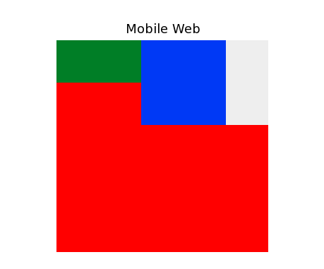
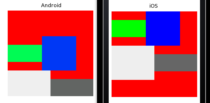
When creating a horizontal layout containing the same set of views on Android and iOS, the views display differently.
var win = Ti.UI.createWindow({ fullscreen: true, backgroundColor: 'white'});
//Horizontal Layout behavior. Green child centered vertically (No positioning pins)
var parent = Ti.UI.createView({backgroundColor:'red',layout:'horizontal',width:300, height:300})
var child1 =Ti.UI.createView({backgroundColor:'green',height:60,width:150});
var child2 =Ti.UI.createView({backgroundColor:'blue',height:120,width:120});
var child3 =Ti.UI.createView({backgroundColor:'#eee',height:120,width:150});
var child4 =Ti.UI.createView({backgroundColor:'#666',height:60,width:150});

parent.add(child1);
parent.add(child2);
parent.add(child3);
parent.add(child4);

win.add(parent);
win.open();
Attachments
| File | Date | Size |
|---|---|---|
| horizontal_layout_mobileweb.png | 2012-04-10T23:22:53.000+0000 | 5693 |
| horizontal_layout.png | 2012-04-10T23:20:28.000+0000 | 18120 |
Pictures are awesome. :D Anyway, I don't know what composite layout specification contains (it's still top secret for outside world :( ), but I really miss functionality like "float" is in CSS world. It would be extremely useful if there was something like that. When building forms, typical use-case is to have label and input element like this: label1 input1 label2 input2 ... To achieve this, parent container must have "vertical" layout and all label-inputs needs to be wrapped with view that have "horizontal" layout (ok, this can be achieved by setting parent's layout property to "absolute" and hardcode position of label-inputs, but that is limited in dynamic scenarios when there are components that can change their height dynamically). That solution is fine, but it is not optimal and it impacts performances when there are a lot of elements (one extra view needs to be created for every label-input pair). So, IMHO, having something like "float" could be very benifitical in use-case I described. Sorry for invading this issue, this does not belong here, but it's related (hopefully we can have a decent place for discussion, heh?). :)
Hi Ivan, Yeah, you could sort of do that with 'horizontal' as it is defined in iOS, but I don't think it's optimal, and I also think there are valid use cases for 'horizontal' as it was defined on Android. The label/input use case is such a common one that we should really provide a simpler way to put it together.
Fixed sample code to match screenshots.
Corrected description. This is NOT a behavior change on Android, but handling of this layout type should be made consistent. Given the wrapping behavior, iOS is probably doing this the 'right' way. But it really seems like this should be a separate layout mode and we should have a normal 'horizontal'.
Ivan: Until we have a discussion forum available... One approach to the type of layout you described is to use the 'horizontal' layout and use percentage widths adding up to 100% for the label and input field. Here's an example:
var labelColor = '#59a9e3'; var makeDivider = function() { return Ti.UI.createView({ top: 0, width: '100%', height: 1, backgroundColor: '#484848' }); }; // // create base UI tab and root window // var win1 = Titanium.UI.createWindow({ title:'Form Test', backgroundColor:'#eee', layout: 'horizontal' }); label1 = Ti.UI.createLabel({ top: 0, textAlign: Ti.UI.TEXT_ALIGNMENT_RIGHT, color: labelColor, width: '20%', height: '50dp', text: 'Name' }); input1 = Ti.UI.createTextField({ top: 0, left: '2%', width: '78%', height: '50dp', backgroundImage: 'none' }); label2 = Ti.UI.createLabel({ top: 0, color: labelColor, textAlign: Ti.UI.TEXT_ALIGNMENT_RIGHT, text: 'Rank', width: '20%', height: '50dp' }); input2 = Ti.UI.createTextField({ top: 0, left: '2%', width: '78%', height: '50dp', backgroundImage: 'none' }); win1.add(label1); win1.add(input1); win1.add(makeDivider()); win1.add(label2); win1.add(input2); win1.add(makeDivider()); win1.open();Arthur, thanks a lot. That's exactly what I wanted to achieve. But that solution does not work for ScrollView (and ScrollView must be used when there is large number of form components present). Btw, ScrollView component has issues on Android and usually wrapping ScrollView's content with basic View helps. I tried to play a bit with your code and I managed to come to some solution (it has some issues, but could be used as a workaround)
var labelColor = '#59a9e3'; var makeDivider = function() { return Ti.UI.createView({ top: 0, width: '100%', height: 1, backgroundColor: '#484848' }); }; // // create base UI tab and root window // var win1 = Titanium.UI.createWindow({ title:'Form Test', navBarHidden: true, backgroundColor:'#eee' }); var wrapper = Ti.UI.createView({ width: '100%', height: '150%', layout: 'horizontal' }); var view = Ti.UI.createScrollView({ contentWidth: 'auto', contentHeight: 'auto', width: '100%', height: '100%' }); for (var i = 0; i < 100; ++i) { var label1 = Ti.UI.createLabel({ top: 0, textAlign: Ti.UI.TEXT_ALIGNMENT_RIGHT, color: labelColor, width: '20%', height: '50dp', text: 'Name ' + i }); var input1 = Ti.UI.createTextField({ top: 0, left: '2%', width: '78%', height: '50dp', backgroundImage: 'none' }); wrapper.add(label1); wrapper.add(input1); wrapper.add(makeDivider()); } view.add(wrapper); win1.add(view); win1.open();We do have internal mechanisms for setting the default horizontal/vertical alignment in views, as the ticket suggests, and we have default vertical alignment of horizontal layout rows coming in TIMOB-8275.
FYI TIMOB-8275 has been completed and merged, so Mobile Web now has wrapping in horizontal views. The screenshots attached to the ticket should probably be updated.
Android and iOS are now match. MobileWeb needs a fix, afaik.
PR is in for Mobile Web.
Closing ticket as fixed.